

Revolutionizing Mailroom Dynamics
User feedback led to innovative design changes that saved valuable time and improved the overall experience.
Role
Lead Designer
Timeline
Mar 2023 - Apr 2023
Skills
User Research
User Interviews
UI Design
Design Systems
Prototyping
Tools
Figma
Notion
Jira
Zoom
Background
Imagine me as the sole designer in a small product team at early-stage PilotoMail, working alongside two engineers. We were a small team with big ambitions. Low on resources and starting to build a data framework to help us track the success of our releases. Although with limited data visibility at the time, we were fortunate enough to have a good relationship with our users and we knew if we wanted to improve we had to tap on that resource.
Mission
At PilotoMail, we're a dynamic SAAS startup dedicated to transforming mailroom automation and virtual mailbox solutions.
Our mission?
To optimize mailroom operations, cut costs, and ensure USPS compliance for operators (those who manage mailrooms).
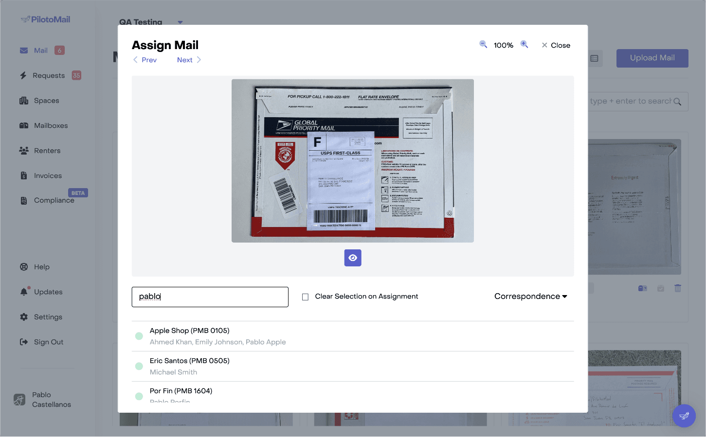
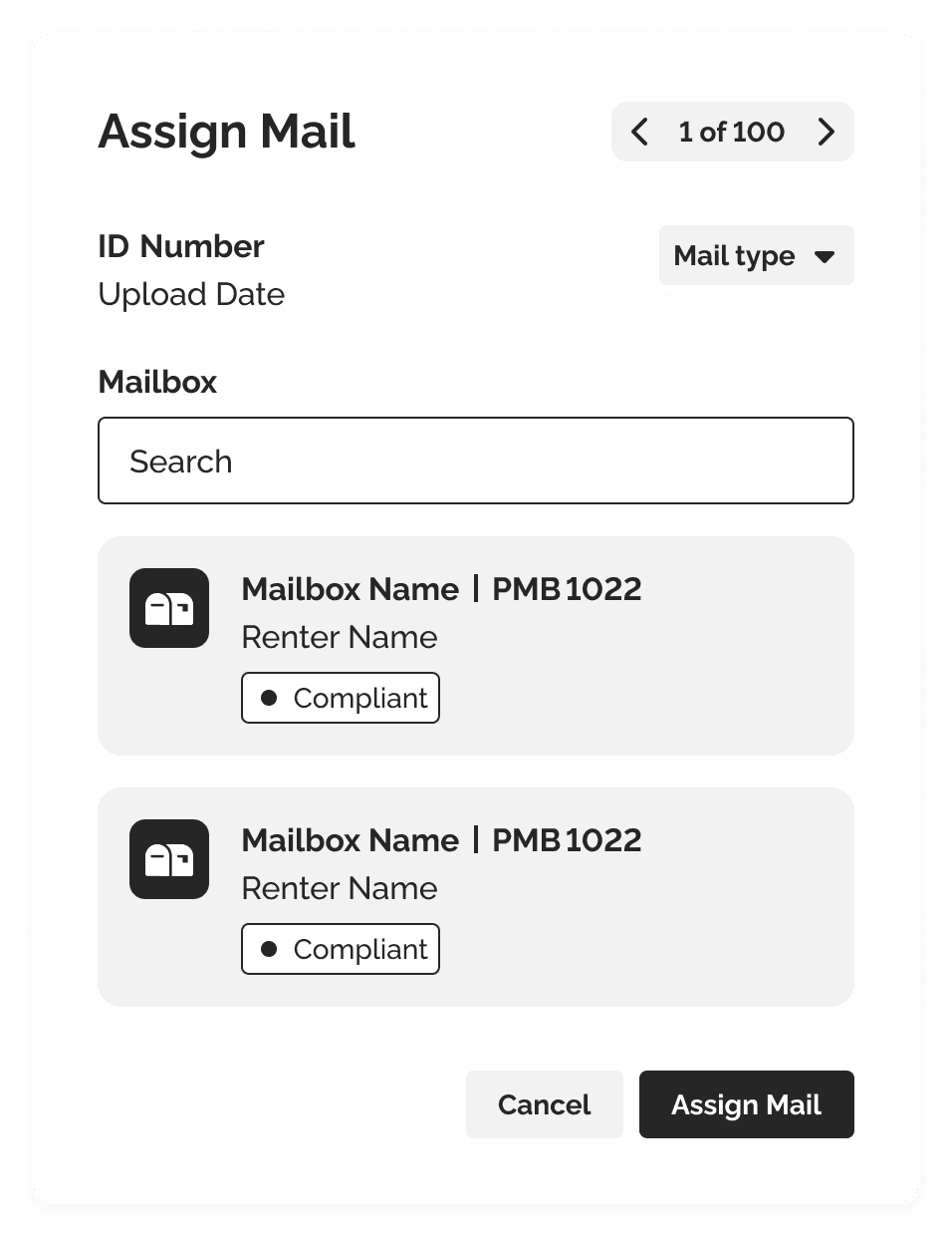
Mail Assignment
The first step for any mail operator is uploading mail, but that’s just the beginning. One of our core features — and arguably the most critical — is Mail Assignment, where operators link the uploaded mail to the mailbox.
Image: Initial version of mail assingment.
However…
During the MVP development, user feedback access was limited, leading the team to make several assumptions. While assumptions are acceptable in the early stages, we had reached a point where users were eagerly calling for improvements. Assumptions weren't going to cut it anymore.
Discovery
The Problem
We had validated the product's potential, and with new features on the horizon, we were set on streamlining the mail assignment process and reduce the time it took for operators.
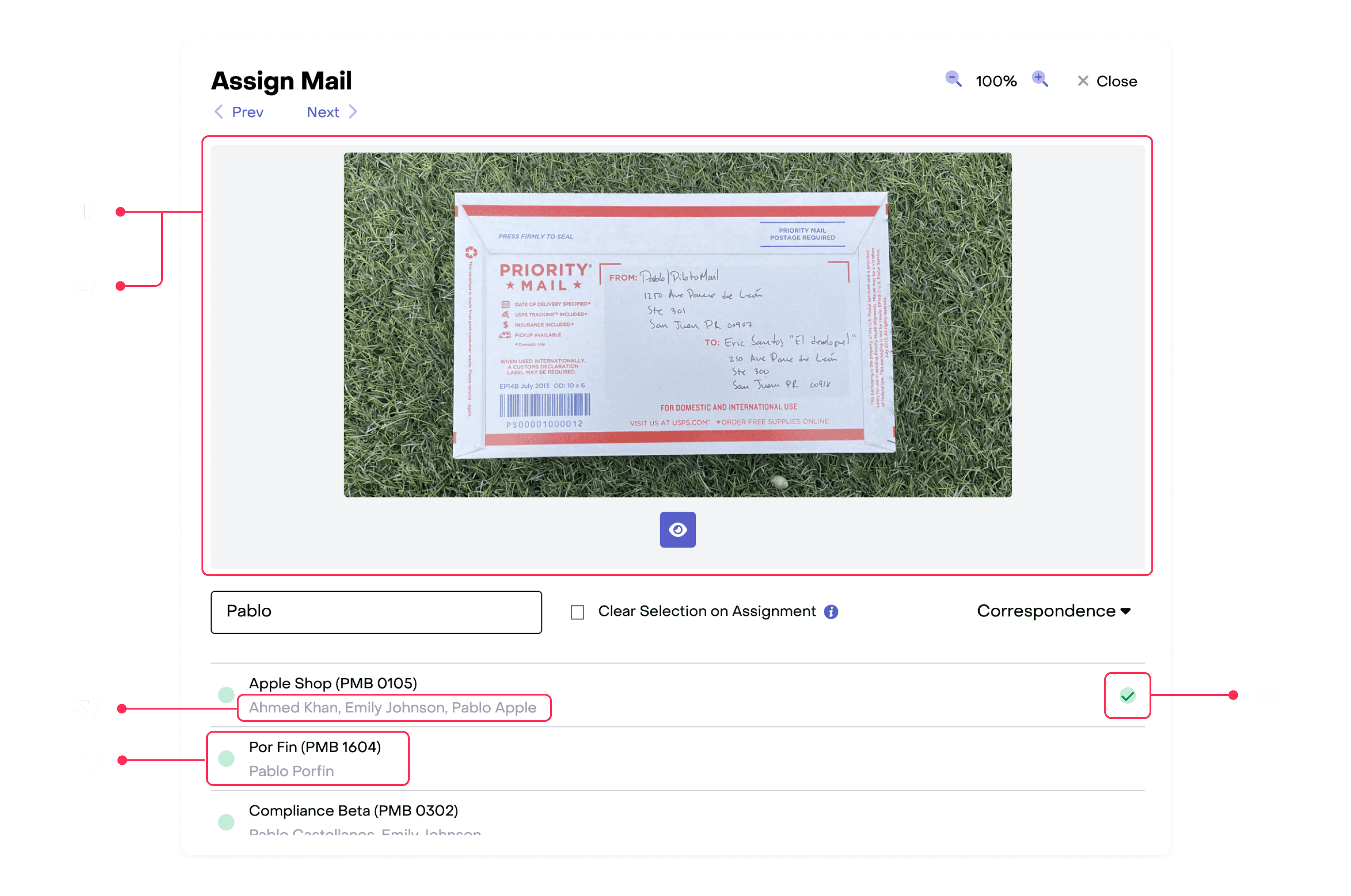
However, operators struggled with basic tasks like reading recipient names from mail images and selecting mail types, as the interface didn’t make these actions clearly clickable. These issues contributed to longer mail assignment completion times.
If you're curious about the types of mail operators handle.
83%
of it is correspondence — is just regular mail like letters and bank statements.
Goal
Reduce the time required for postal mail management, allowing operators to allocate more time to other tasks.
Understand
Research
1/ User Interviews
Twelve operators participated in our interviews, and by the fifth one, we started to see clear patterns emerging.
2/ Competitive Analysis
We focused on evaluating functionality, marketing strategies, and pricing models of industry competitors. This approach helped us gain insights into how similar features were implemented and identified key areas for improvement and differentiation.
How to set a baseline?
After timing several mail assignments, we found that it took an average of 22 seconds per assignment under ideal conditions—where there were no errors and the mail image was fully visible. In real-world scenarios, this could extend to a full minute. We believed that by reducing the number of interactions required for mail assignment, we could significantly cut down on the time it took. While this was a major assumption, it served as our starting point for further investigation.
Assesment based on user interviews.
What the operators had to say
1/ Crop Image
With only one image ratio available on our mobile app, the correspondence often appeared too far from the frame, resulting in small images with excessive white space.
2/ Zoom
Depending on how the image was uploaded, it could be rotated or too distant from the frame, forcing operators to zoom or adjust the view to read the mailbox name — the issue? Ours didn't work.
3/ Selected Mailbox
The indicator for the selected mailbox in the list was difficult to see.
4/ Compliance Visibility
The compliance status was absent during the mail assignment process.
5/ Recipients Visibility
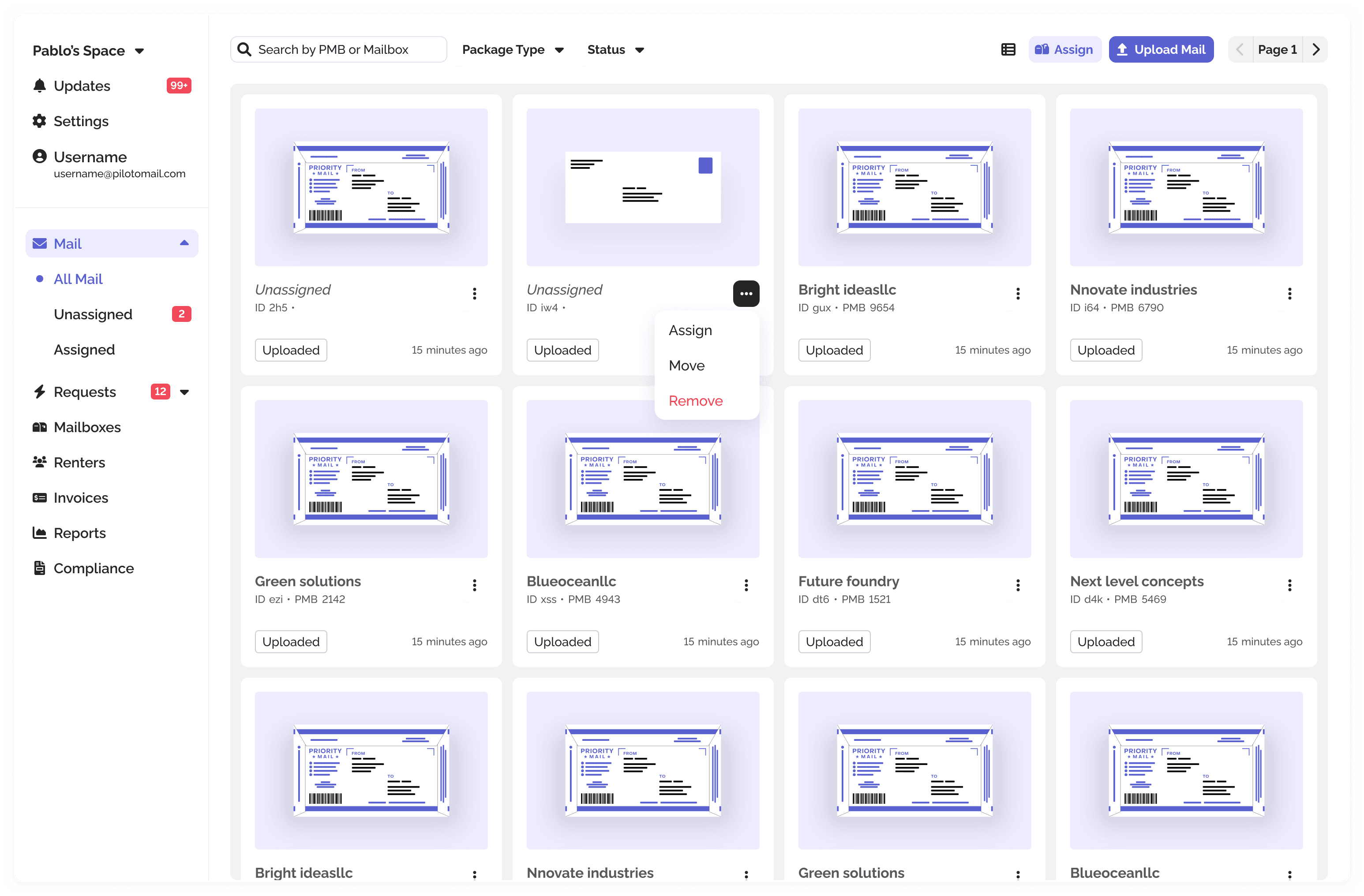
Operators could search by PMB, mailbox name, or recipient name, but the displayed recipient was always the mailbox owner, not the person they searched for.
6/ Mail Information
The mail image was the only information shown during mail assignment, but operators needed to see the mail ID for better identification.
Competitive Analysis
Here's what we found:

Spheremail
iWorkspaceMail
Spheremail
The process for adding new mail and assigning it is part of the insertion flow, but it doesn’t require an image of the mail. The platform also doesn’t provide details on mailboxes or recipients and uses a continuous insertion method similar to our mail assignment process.
iWorkspaceMail—iPostal
To insert a mail item, it must be done directly into the mailbox, which means there’s no concept of unassigned mail. The process requires a photo and is fully mobile-based. They have an auto-crop feature that we aspire to implement but haven't yet.
Difference in Philosophy
Our competitors combine mail upload and assignment into a single flow, whereas we separate these processes. In our approach, mail upload involves simply adding mail images, while mail assignment links these images to a mailbox. This separation allows us to streamline each task and improve efficiency, enabling background technology to minimize manual labor. For example, our Smart Assignment feature analyzes mail images and extracts information to reduce the steps needed for assignment, with operators acting as QA to ensure the system performs correctly.
Mail Assignment Flow

Indentify
Product Principles
Be a helping hand
Handling tasks that don’t require their direct input, allowing them to focus on strategic actions.
Provide Context
Display key information, including dates, statuses, and errors, to keep operators well-informed.
Show Progress
Highlight the operator’s current position, encourage continued progress, and guide them to the next steps.
How to implement our principles to mail assignment?
Be a helping hand
Smart Assignment
Utilize our technology to automatically analyze mail and identify the corresponding mailbox, saving operators time and effort in manual searches.
Provide Context
Information Navigation
Display essential mailbox details, such as compliance status, and offer image zoom and movement features to ensure operators have the necessary information to proceed smoothly.
Show Progress
Action Feedback
Use toast notifications to confirm actions and build anticipation for completing the final task. Clearly indicate where users should focus once all tasks are finished.
Ideation
More space, more info?
We decided to implement a side-by-side layout to maximize screen space. This straightforward change addressed many issues identified in user interviews by providing more information and improving overall usability.
Image: Wireframe of side by side layout.
Assignment Information
With the mail image now properly displayed, we shifted focus to showcasing key mail information. The Mail ID is visible during assignment to streamline the process. Additionally, we include the upload date to help operators identify any delays. To enhance efficiency, we show the total number of mail pieces awaiting assignment to provide a progress indicator, aligning with the concept of continuous assignment and keeping operators informed of their progress.
Option 1

Option 2
Option 1
To maximize image visibility, we redesigned the layout to a side-by-side view. We prioritized compactness by keeping elements close together while ensuring readability. Additionally, we introduced an icon that changes color based on the mailbox's color, providing a clear visual cue.
Option 2
We aimed to make the flow as linear as possible, both in steps and click points. By incorporating descriptive text with almost all elements, we eliminated ambiguity and ensured that operators could easily understand each component without having to guess its function.
This is how operators assign now

Navigate Mail Images
To address the issues regarding image visibility we've added auto-crop to the mail upload. To complement a bigger container for the image to be displayed we also added image controls like "Analyze Image", "Crop", and "Pan Zoom".
Triggering Mail Assignment
Previously, each mail piece had its own assign button. Now, while operators can still start the assignment process with any mail item, all mail must be assigned by the end of the day. We streamlined this by introducing a single button that triggers the assignment process starting with the oldest mail item and progresses sequentially. This eliminates the need for operators to search for pending mail items, simplifying the assignment workflow.

1.0/ Continuous Assignment
Operators now have a dedicated button for continuous assignment at the top of the screen, providing a more accessible workflow. (Shoutout to Rocio Gracia, the designer responsible for the "Mail" screen.)
1.1/ Focused Assignment
We recognize that operators value having the assign button on each mail item. Rather than removing it, we chose to hide it, guiding the workflow towards the new, centralized "Assign" button while still retaining the option for individual assignment.

2/ Smart Assignment
Regardless of which assign trigger is used, both will lead to the same screen. The only difference will be which mail item appears first, along with a suggested mailbox for quick assignment.
Smart Assignment
We can analyze text in images to identify the corresponding mailbox for each mail item. However, we believe operators should always feel empowered and in charge. While we use technology to make suggestions and assist with the workload, by leaving the final say to the operator, we prioritize minimizing tech-related errors and enforce the feeling of empowerment. Our idea acknowledges technological limitations and focuses on enhancing user control.
Continuous Assign + Smart Assign = Mail Assignment Cheat Code
But what if the operator prefers not to use smart assigning?
The current design accommodates a fully manual process, allowing the operator to select the mail type, search for the mailbox, and assign the mail themselves.
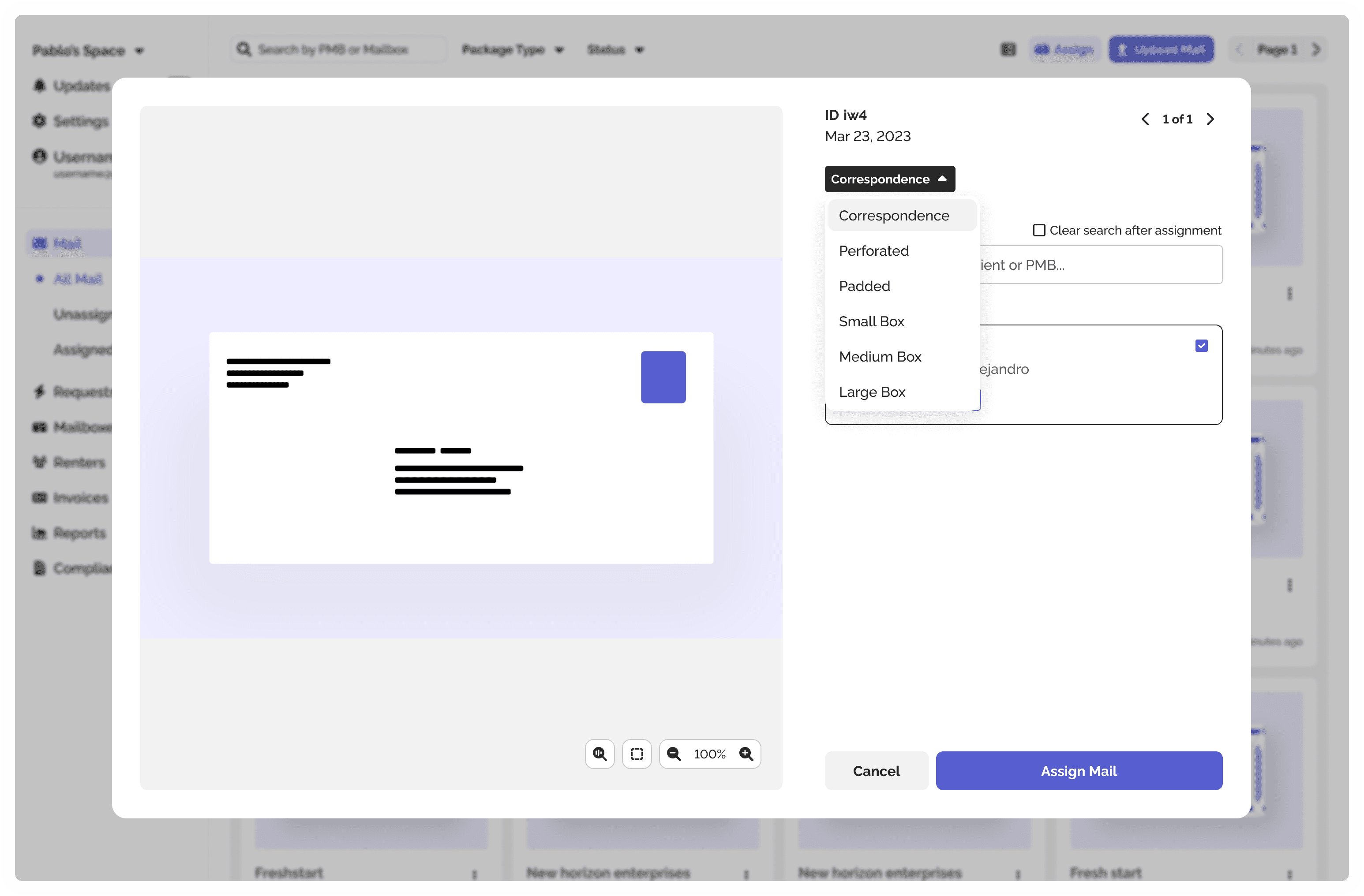
3/ Select Mail Type
By default the mail type will be "Correspondence", however the operator will be able to change it to the appropriate mail type.
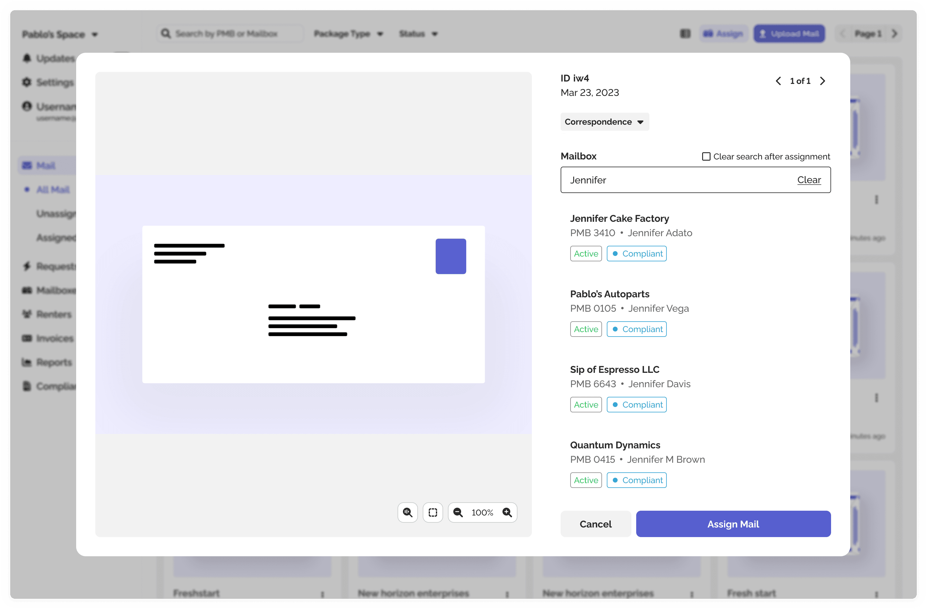
4/ Search for Mailbox
The search is straightforward, showing key details like compliance status and mailbox status for each result.
5/ Select Mailbox
The mailbox selection indicator has been enhanced for better visibility and clarity.
Thanks for checking out this case study.
If you have any questions, please don’t hesitate to reach out via email.
Here are a few more projects I worked on at PilotoMail, each contributing to our innovative solutions and user experience enhancements.

PilotoMail Landing Page Concept

Mail Pick Up Code

Plan Builder